
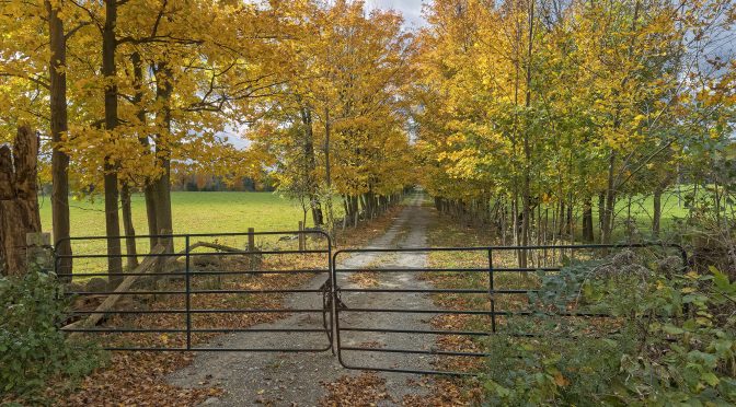
For many photographers in the Northern hemisphere, this is one of their favourite times of the year as they are able to capture beautiful fall colours… and enjoy the change of seasons.
NOTE: Click on images to enlarge. To view this article in a range of other languages click on the Canadian flag in the upper right corner.

In preparation for this article I went through my image archives for this website to identify photographs with some fall colours.

After looking through over 16,000 images, it was actually not surprising that I didn’t find very many images in my archives that featured fall colours.

I’ve never professed to be a landscape photographer… and I rarely go out with my camera with the specific objective of photographing landscapes.
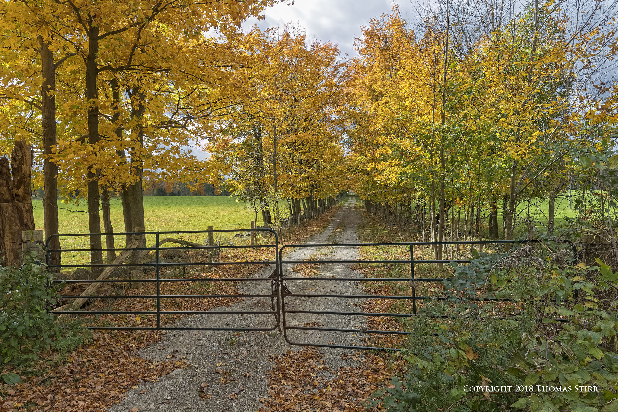
Peak colour in Southern Ontario varies significantly by physical location, the forest mix, and can be fleeting in terms of time frame.
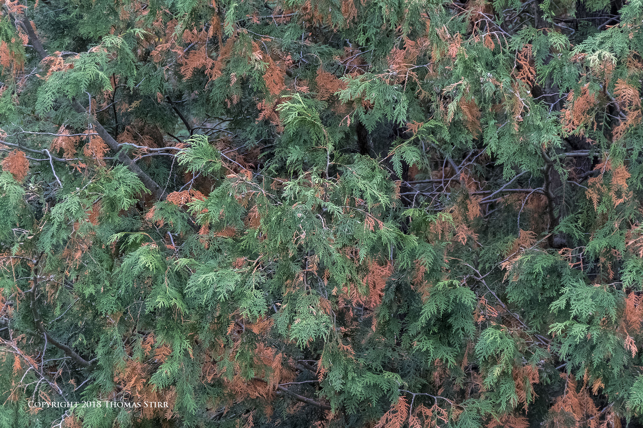
Whenever I make time to go out into nature with the intent to photograph landscapes I do enjoy the experience. I love the scents of the forests.
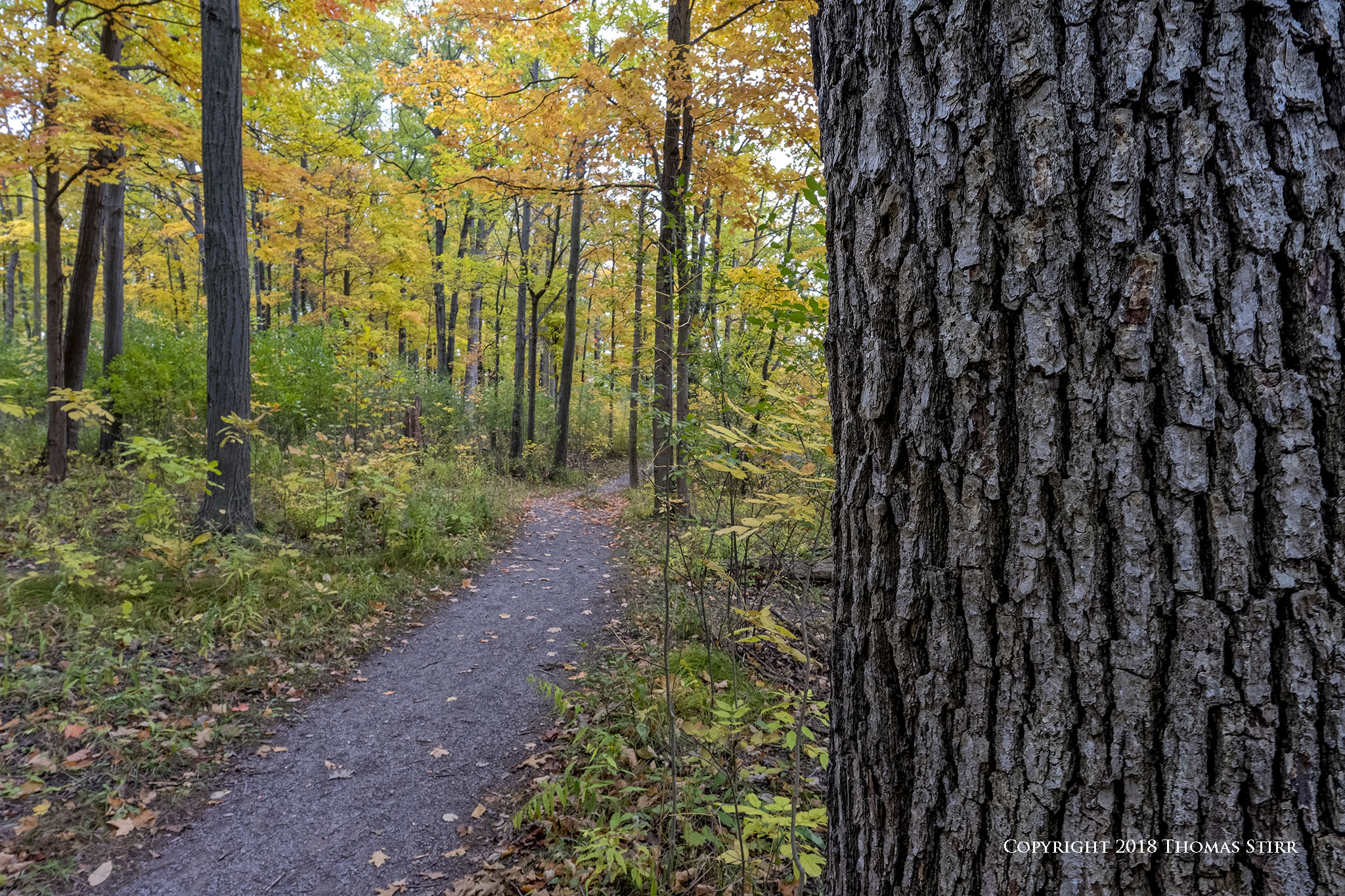
Walking along trails can be quiet and tranquil… or I may be treated to the sounds of some birds in the canopy, or on branches and tree trunks.
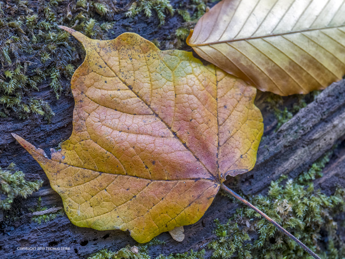
Most often I use ‘soft eyes’ technique and let my eyes wander. They often stop at small dashes of colour, or are attracted to geometric shapes and lines.
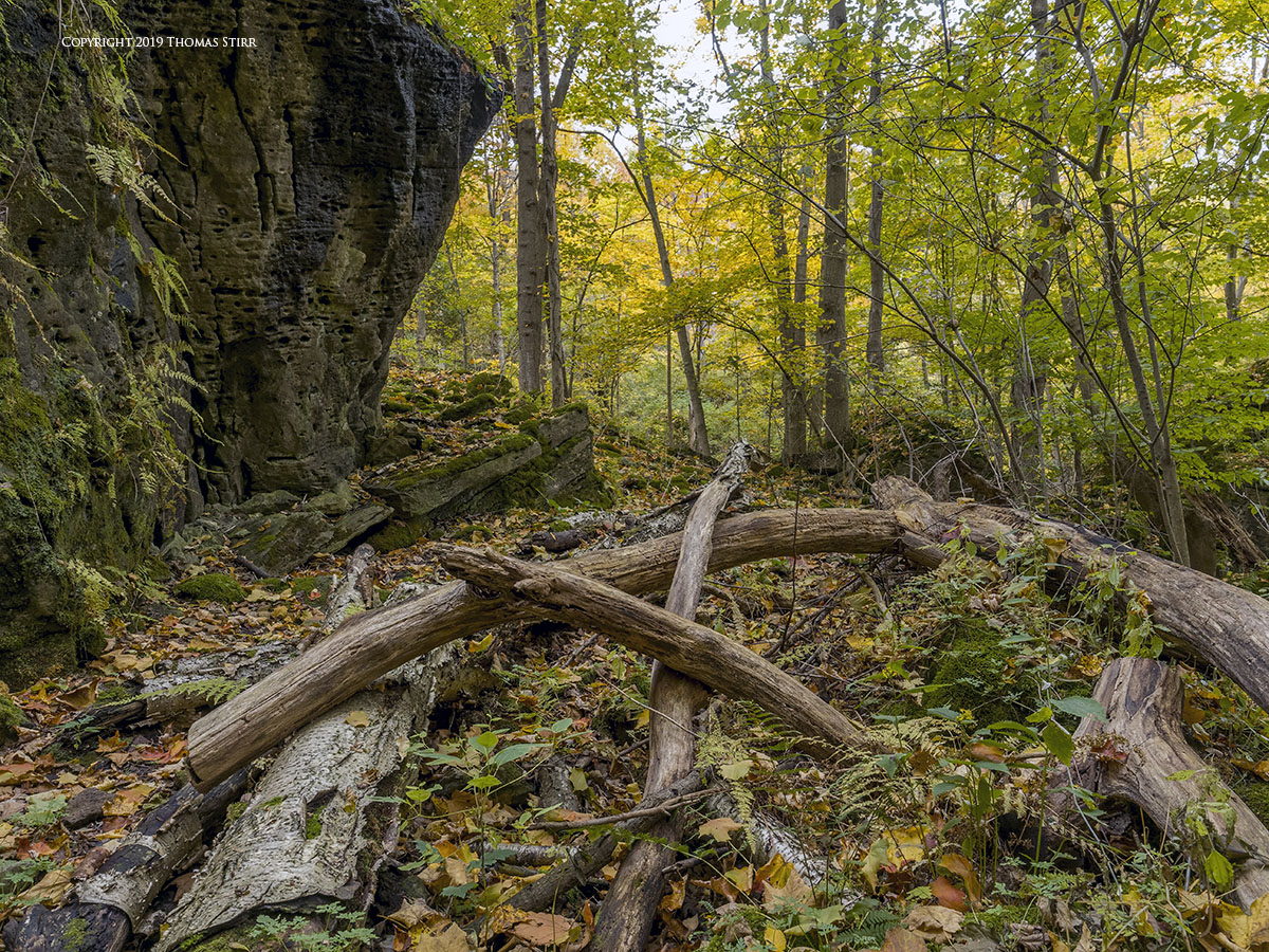
Whenever I do capture landscape images, especially those that feature fall colours, I handle them differently in post.
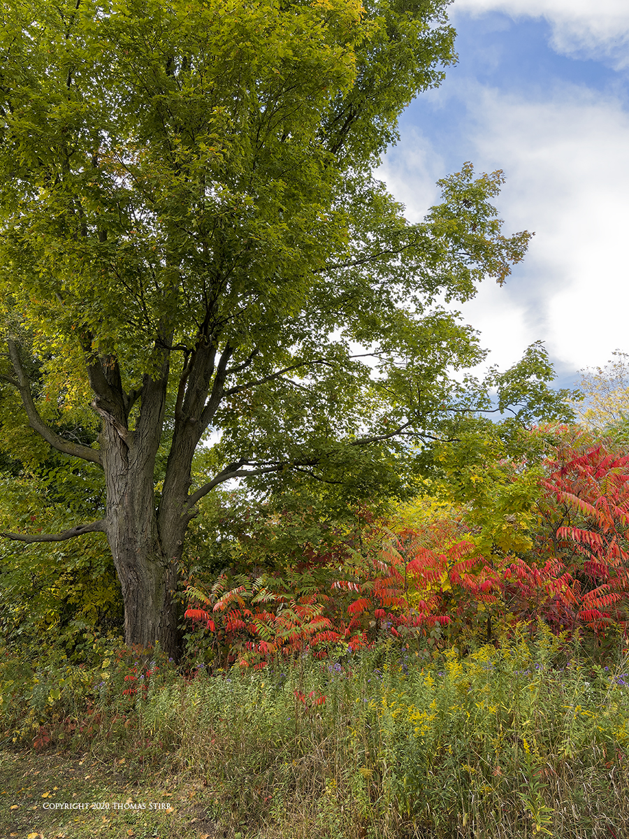
I very rarely use any kind of sharpening with landscape compositions as I find that can make leaves look too well defined and artificial.

If an image needs more edge acuity I prefer to adjust contrast settings. One of the settings that I frequently use is Pro Contrast. This is a part of the Color Efex Pro 4 section in my old copy of the Nik Collection.
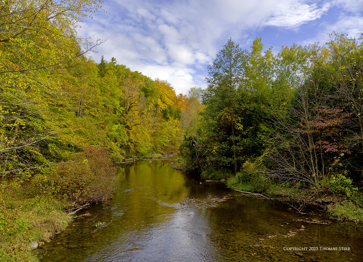
I also use the Polarization function, which is found in the same area in the Nik Collection. This helps to create richer colours in the sky.
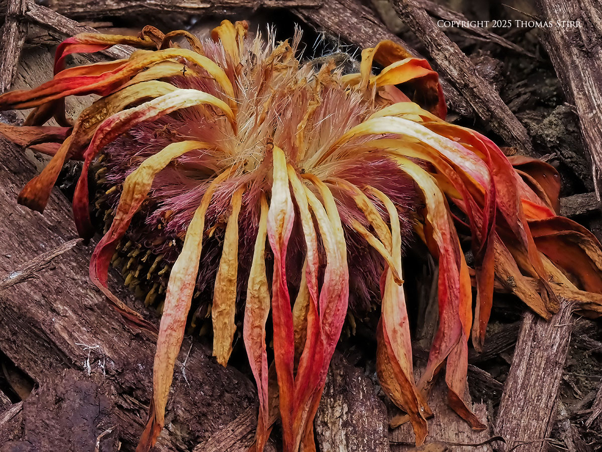
My ancient copy of PhotoShop CS6 also has a couple of features that I regularly use for landscape images. Under ‘Image – Adjustments’ I often use the ‘Curves’ function. This shifts the overall colour balance and contrast in a photograph. I typically use one of the four Auto Colour Correction Options.
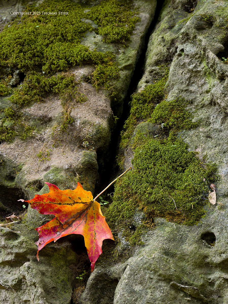
When needed I will adjust individual colours using the Hue/Saturation function. This is very helpful when I want a particular colour or two to have a bit more pop.
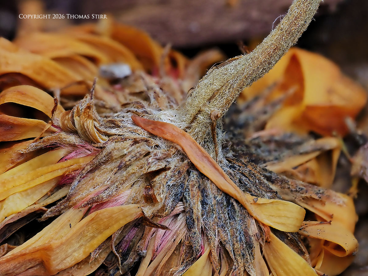
Another useful setting in PhotoShop CS6 is Levels. I use this to shift the overall exposure and contrast in a landscape file. Sometimes even slight slider movements can result in a much improved appearance.
So, for all of you who enjoy fall colours… grab your cameras and have some fun during this special time of year!
Technical Note
Photographs featured in this article were captured handheld using camera gear noted in the EXIF data. Images were created from RAW files using my standard process in post. This is the 1550 article published on this website since its original inception in 2015.
Copyright
Word of mouth is the best form of endorsement. If you like our website please let your friends and associates know about our work. Linking to this site or to specific articles is allowed with proper acknowledgement. Reproducing articles, or any of the images contained in them, on another website or in any social media posting is a Copyright infringement.
Article is Copyright 2026 Thomas Stirr. Images are Copyright 2014-2026 Thomas Stirr. No use, duplication or adaptation of any kind is allowed without written consent. If you see this article reproduced anywhere else it is an unauthorized and illegal use. Posting comments on offending websites and calling out individuals who steal intellectual property is deeply appreciated.